Industrial music was my first musical romance. I was a teen in the 1990’s, so I endured the grunge phase with enthusiasm, but once I discovered Nine Inch Nails, Ministry, and Skinny Puppy, Seattle was all but dead to me. Industrial was such a fascinating combination: cold, whirring mechanical sounds meshing with sampled movie dialog, strung together in a way that’s something like punk and rock and roll, but not really at all. I was hooked, and this addiction inspired research into earlier industrial acts like Throbbing Gristle, Cabaret Voltaire, and Einsturzende Neubauten. As it turns out, industrial music wasn’t just “electronic music with guitars”, it was what punk set out to be: noisy and subversive, adding an avant-garde approach to songwriting that was anything but familiar. Sometimes you would dance to it, sometimes you would be assaulted by it.
Proto-industrial musicians didn’t like boundaries, and neither did their sleeve designers. Album covers were often mysterious, barely relaying what the audio inside actually sounded like, or were high-stylized concepts that merged modern typography with dismal, always manipulated photography.
I remember visiting Lakeside Mall in Sterling Heights, Michigan, sometime around 1996. I had my own money from working part-time as a stockboy in a small grocery store chain, and I was eager to spend it. I begged my dad to let me scour the handful of record stores on my own. He eventually relented, so I visited the Harmony House that had been shoehorned into a smallish L-shaped suite on the second level, adjacent to a massive department store (probably Sears or Lord And Taylor). I was eager to pick the fruit of my research: specifically anything I could find by Candian electro-industrial pioneers, Skinny Puppy.
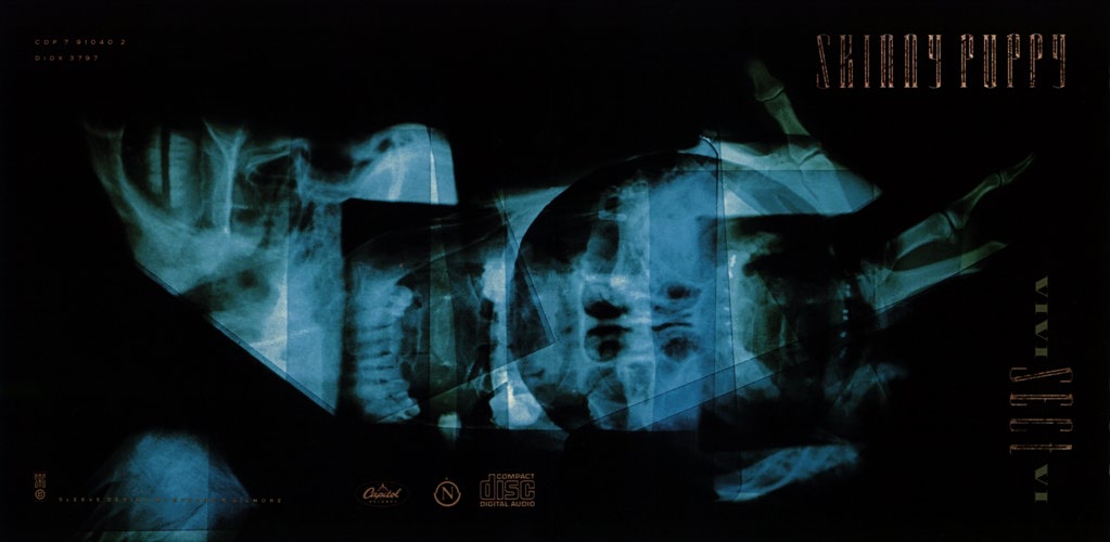
There was a small selection of Puppy CDs in the dominoed displays of albums, however, VIVIsectVI was the one that grabbed my attention. Blue and turquoise x-rays of human skulls and hands overlayed on seamless black, with distressed Didone-like typefaces smuggled into the corners. Not only was the cover menacingly beautiful, but the first track on the album was fucking called Dogshit.
I had to have it.
Steven has been a part of my creative life since it’s conception. When we first met I found myself cowering a bit in the perceived darkness and intensity that surrounded him. His work reflects this intensity, and his neurotic need to dig deeper into the dark places that haunt him pushes the envelope even further. This is tempered with an incredible sense of humor and insight from listening to the artist and then taking the concept well beyond expectation to a more refined pictorial/graphic statement. I just share my ideas and get out of the way!
-Nivek Ogre (Skinny Puppy). 1
Admittedly, VIVIsectVI took some warming up to. Dogshit was brutal and intense. The distorted shrieks of Nivek Ogre led a chorus of backmasked sounds and churning synths, interjected by humming, distorted guitars. And that, besides maybe Testure, was the most accessible song on the record. Nearly every track on it was a political statement of some kind, surrounded by overdriven instrumentation that is somehow held together with beats that could be considered danceable. It took quite a few listening sessions, but once it clicked, it clicked big.
And thus began something like an obsession. Skinny Puppy (not unlike Nine Inch Nails) became one of the few bands where I had to have it all. Singles, LPs, stickers, shirts, I needed that shit. And after you’ve collected a few items, scoured the liner notes, and turned the art over in your hands over and over and over… even a naive high school student (who had very little interest in art at the time) could pick up on the patterns.
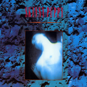
You see, the majority of Skinny Puppy’s visual representations were done by one man. Sure, there were a handful of releases featuring artwork by other artists (most notably Jimmy Cummins, aka I, Braineater), but the vast majority of their albums were designed a Mr. Steven R. Gilmore. I counted twenty-six Skinny Puppy releases credited to Gilmore on Discogs.com, and that doesn’t include uncredited works, remixed visuals for imports, or various editions.
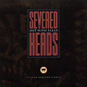
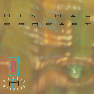
And as I dug deeper into the industrial genre as a whole, those same, familiar art styles were becoming more and more recognizable. Gilmore created artwork for a multitude of underground music projects. In the mid-1980’s, he was the go-to artist for Nettwerk Records, a small, Vancouver-based, indie start-up label that was instrumental in bringing underground dance music into popularity. Nettwerk released music by recording artists such as Moev (featuring Mark Jowett, a founding member of Nettwerk), Severed Heads, Skinny Puppy, Manufacture, and Chris and Cosey (two former members of Throbbing Gristle).
I first met Terry McBride (who would later form Nettwerk Records along with others) while I was DJing at the Luv-A-Fair nightclub in Vancouver. He came in one night and asked if I would spin one of the acts he was managing who had just released their first EP “Cracked Mirror”. The band’s name was Moev.
From there one thing led to another and I ended up creating the artwork for Nettwerk’s first release in 1984 and many more after that. I guess it was a natural fit, besides DJing I was already quite established in the music industry of Vancouver as I had done several posters for (both local and international) bands that were performing in town as well as creating sleeves for numerous local acts.
-Steven R. Gilmore. 2
Influence

In the mid-to-late 70’s, a talented, young designer emerged on the scene in London. He cut his teeth on local punk rock album covers and posters. The London College of Printing student was a rebel in the design world, with his teachers and critics deeming his work to be commercially unviable.
However, someone was paying attention to Neville Brody.
Brody was approached by Fetish Records, a London-based record label that was exposing new, pioneering industrial and underground bands, and asked him to manage the visuals for their releases.
I started to realize quite clearly that social rules, specifically graphic design rules, were irrelevant. They were created by different people for different societies at a different time to solve different problems. We were still being taught that this is the way we had to do it. It led me to thinking that anything was fair game, anything was challengeable.
-Neville Brody. 3
Brody went on to design artwork for a slew of strange, new musical groups: Cabaret Voltaire, Clock DVA, 23 Skidoo, and Psychic TV, to name a very small few. Brody has since founded several design companies, been an art director for a magazine, and has authored numerous design campaigns for massive brands, despite having failed out of a design university. The irony is just gorgeous.
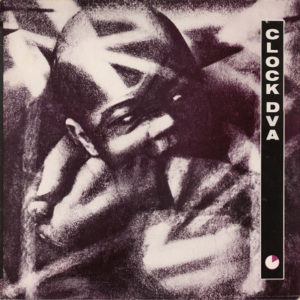
Steven R. Gilmore has stated in several interviews that Brody’s work had a tremendous impact on him. “One of my favorite album sleeve designs at the time (and still is) was Clock DVA’s ‘Thirst’ by Neville Brody. There was something so new and different about that sleeve, so I tried to track down as much information as I could on Neville Brody and what made him tick. And trying to find out more about him led to more knowledge about design in general.” 4
Technique
When I first started out in design everything was based around the traditional cut-and-paste technique… I went through a lot of spray glue back then.
-Steven R. Gilmore. 5
Post-World War I, many album covers that weren’t completely hand-painted or illustrated were collage works. Individual assets were glued or painted onto clear sheets of cellulose acetate and then layered in a way that made sense to the designer. The finished collage was then photographed in a controlled environment or in a photomultiplier (aka PMT) machine, or sent to a typesetter to do the final reproduction.
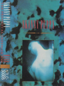
Let’s take a look at one of Gilmore’s most (in)famous works, Skinny Puppy’s Mind: The Perpetual Intercourse. The album, originally released in 1986, came in three similar designs to accommodate the common media formats of the day: vinyl record albums, tape cassettes, and compact discs.
For simplicity’s sake, I’ll only be discussing the front cover of the album and not including liner notes or booklets, spines, or reverse covers.
Mind is a simple example of collage design. A lot of Gilmore’s work are collages, incorporating photography with found or handmade textures and illustrated elements or even Renaissance era woodcuts.
The primary subject of the design is a photograph of a nude woman. According to Gilmore, “it was taken off a porno I was watching in a hotel in New York.” 6 (Amusingly, Tipper Gore cited Mind as an example of why there should be parental advisory stickers on music releases). Each version features a slightly different bordered crop of the photo, with the CD version having the edges the television purposely left visible.
The photo is then placed overtop a textured layer of blue or blue-green, with the CD version again adding an extra bordered beige-grey layer.
Note that the CD displays a different Skinny Puppy logo. The logo as it appears on the vinyl and cassette used typography lifted from a type specimen book. When Gilmore revisited the artwork for the CD version, he decided to use the logo he created for the follow-up album, Cleanse Fold and Manipulate. It also happens to be the only rendition that contains the actual title of the album.
If you’re reading this article, you probably have at least some familiarity with the Adobe Photoshop software and its use of layers to build a composition. Mind was released two years before Photoshop was released. That means this was all done by hand, with each element arranged by layering one on top of the other and then captured to a format that could finally be printed. Not to mention that this was all done at least three times, once for each release type.
Conclusion
As a teenager exploring the music world, much of the album art in the local music shops felt… blah. Perhaps I associated the art with the music, and if I wasn’t interested in the music, the design felt just as lame to me.
Once I discovered underground music culture, it was impossible not to notice how much different design could be. Album art became one of the catalysts for choosing what I tried next, largely because pre-hearing the music on the radio was extremely rare, and the world wide web we know today wasn’t the repository of nearly unending knowledge that it is now. Music had to be researched, either with friends, in stores, or in clubs and venues.
Admittedly, the thrill of the hunt is something I miss. Digital downloads and streams are here to stay, and while vinyl and CDs have had somewhat of a resurgence in recent years, the demand for richly produced album design has gone down in the mainstream. Indeed, a quick browsing of the Billboard Top 100 will reveal that most popular music artists’ cover art is just a photograph of the musician, or bland, uninspired typography on monotone backgrounds. What’s the fun in that? Even Peter Saville, the famous designer of Factory Records, Joy Division, and New Order, has announced that album art is dead. 7
Despite that, the underground music community is, while maybe not thriving, exploding. Bedroom record labels are emerging everywhere, largely thanks to the digital revolution’s extremely low-cost distribution avenues. Photoshop, Illustrator, tabletop scanners, and cameras are readily accessible to anyone with a real desire to make art. The money might be mostly gone from music, but the drive to create persists. Design in music is back in a big way, you just have to know where to look. I know I have, and that’s why I think Steven R. Gilmore is an important figure in music and design.
Footnotes
- Weissberg, David J. “Interview with Steven R. Gilmore”. XLR8R Magazine. Mar/Apr. 2003. Web.
- Gilmore, Steven R., personal communication, April 9, 2018.
- McCormack, Lee. “Neville Brody, graphic designer and typographer”. Designers are wankers. Feb. 2005. Web.
- Kelly, Dennis. Steven R Gilmore Interview. Feb 3. 2012. Web.
- Kelly, Dennis. “Steven R Gilmore Interview”. Feb 3. 2012. Web.
- Weissberg, David J. “Interview with Steven R. Gilmore”. XLR8R Magazine. Mar/Apr. 2003. Web.
- Bosso, Joe. “Yes, the album cover is dead”. musicradar. Apr. 2008. Web.
Additional Credits
The Daily P.O.P.
Discogs.com, Steven R. Gilmore
SR/G Design
SRG Editions: Featuring the Artwork of Steven R Gilmore
Trailer Music News
Wikipedia, Steven R. Gilmore
Wikipedia, Neville Brody
The author of this article reached out to Mr. Gilmore via email for clarifications and corrections. Mr. Gilmore was kind enough to review and submit a few corrections and suggestions. All of those requests were completed.
Consider visiting SRG Editions, an Etsy page where Mr. Gilmore is selling retouched prints of his album designs.
Original feature photo by Brion Topolski. Digital manipulation by Steven R Gilmore in the style of Marlo Pascual. Photograph of Neville Brody by Amber Gregory for FontShop. Attribution 2.0 Generic (CC BY 2.0). Where not provided by Steven R. Gilmore, the majority of the album artwork was sourced from Discogs.com and falls well within the standards set by the United States Fair Use laws.









1 Comment
[…] LABEL owner and graphic designer Joshua McAllister just launched a new blog focusing on the relationship between design and underground music. The first article is on Steven R. Gilmore, the designer for much of Nettwerk Records and WaxTrax! catalogs. Read it today. […]